On March 12, a date special for me, I dropped the new cover for the second (revised) edition of my debut book, a poetry collection called all the little, lonely and forgotten things on my Facebook account. I was happy that it was received well by those who had seen it.
First edition
I’d like to talk about how it came to be, but for context, here’s the cover I made for the first edition.
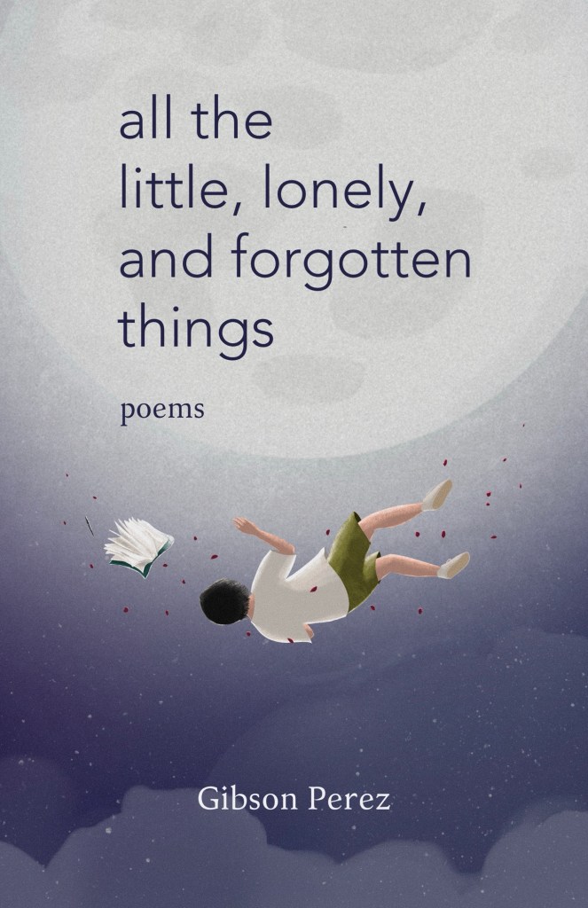
The inspiration for this cover was my dreams when I was a kid. When I said dreams, I meant the bizarre movies that play on our heads when we’re sunk to the REM stage of our sleep. I used to dream about being under the ocean or flying in the sky, and I always loved the latter. I could still remember the images where I swooped over green fields or into forests, or floated only few feet above the ground because that was unfortunately what my power of flight could afford, or soared to the outer space seeing the alignment of planets and constellations. It was otherworldly. I never had the same dreams again, and I thought of blaming adulthood for its disappearance.
As this book was initially a passion project, I wanted to tie up that literal meaning of dream to the abstract sense. Writing had only been one of my many dreams when I was young, but it was the one thing that stuck to me growing up. I wrote amateur novels in high school. I wrote poems in college. And I wrote more during my entry-level era in corporate world (I’m not saying that I have a position now; I’m still an average staff). The point was, to my thinking, the association of flight and writing to represent the word dream was perfect.
Meanwhile, the simple font was a last-minute decision. The book designer from that company tried some cool fonts that were whimsical as I requested, but for some reason I could not give them a green light. Must be my ego to have the creative decision in my full control. (I’m sorry, Cris, but you know I appreciate you.) I also thought of decoratively handwriting the title, but the previously proposed fonts were better. So, I matched the cover font instead with the interior font I chose for the book content (I really combed 1001fonts.com for hours just for that!), holding to the rationale that the book didn’t need fancy cover page. It must be the poems that should speak.
The back cover looked like part of the front cover illustration, but they were actually two different images and were drawn at different times. I only tricked your eyes by making them blend through similar colors and design, using careful strokes on the clouds. Here’s an easter egg: Look at the shape of the cloud at the bottom left — it looked like a face, didn’t it? You can find several of these on the book, and the explanation of its presence. *wink, wink*
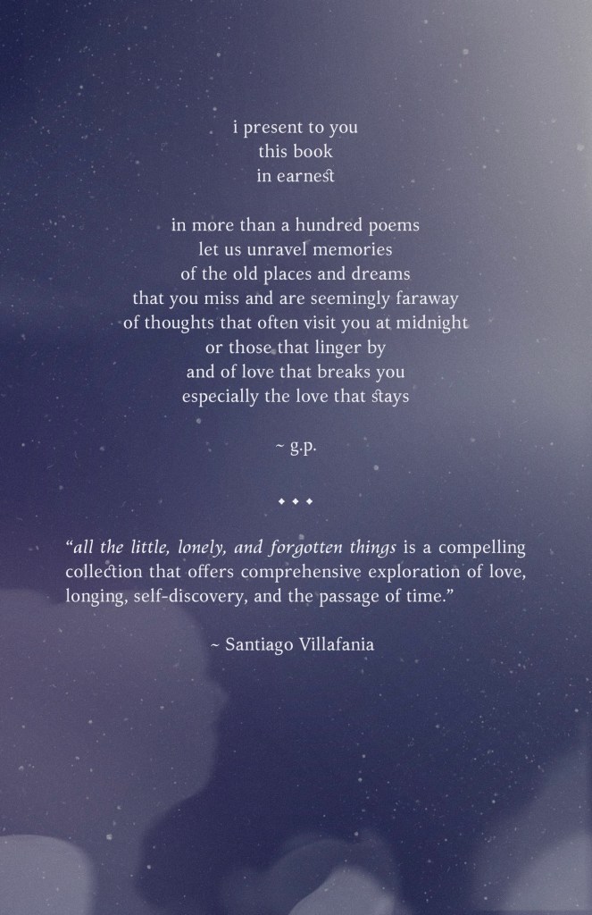
The blurb gave me headache (and the author’s bio, this pair, omg). The book encompassed many themes I found it hard to explain what the book really was. Should “a collection of hugot” suffice, you’d see it in size 35 font. But I couldn’t. So, I created a poem-like description of the book, which I didn’t know if it made sense, feeling like I could only write the book but had not learned to how to read it to describe it well. To make up for it, I added an excerpt from Sir Santiago Villafania’s review and let the judgmental gods lay their verdict. (So what do you think if you’re such a god? Hahahaha. JK.)
I loved the cover, but it gave a vibe of middle-grade fantasy book, which was not bad to my taste, though unsure for poetry readers. But artist and book illustrator ArtbyKarla appreciated the cover (you can watch her reaction on this clip, time stamp 0:00 – 8:40), so I threw away my imposter’s mask and accepted that me, myself and I had created a beautiful cover. These days, it’s encouraged to sprinkle yourself some love. So did I.
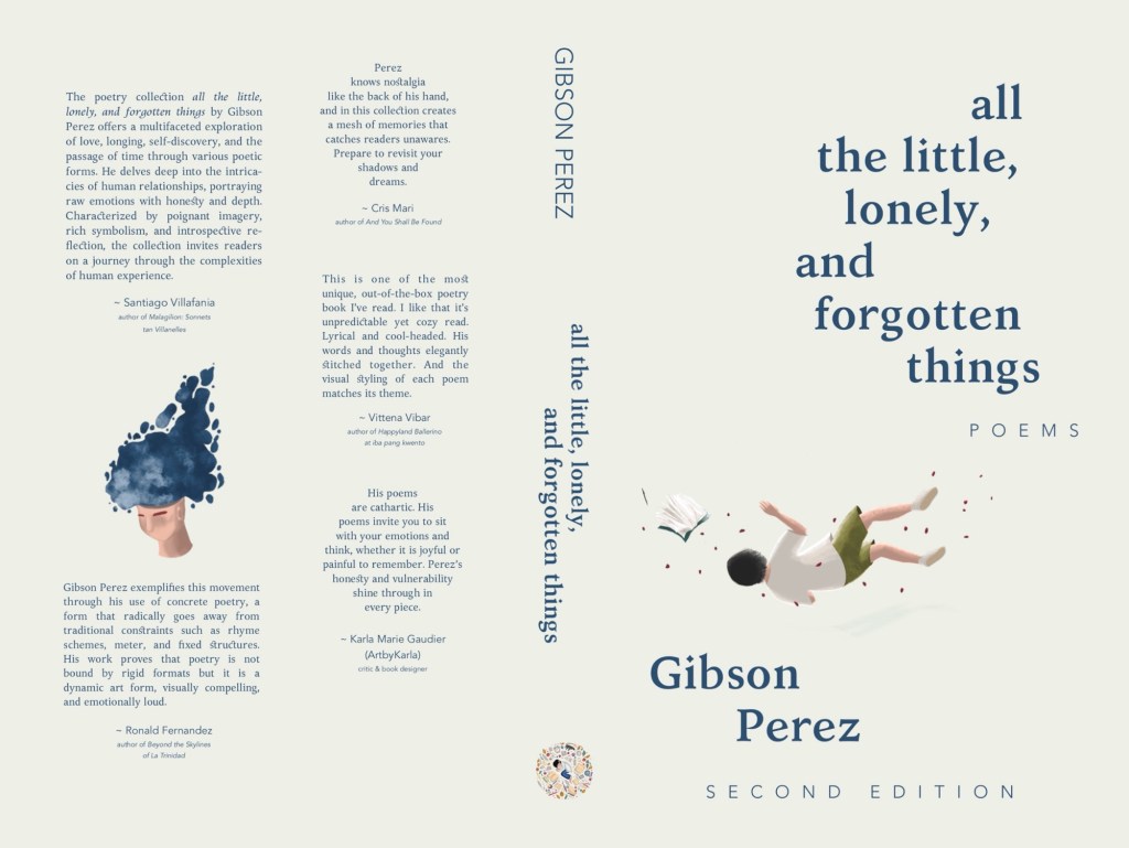
Second edition
Fast forward to 2025, here’s the new cover:
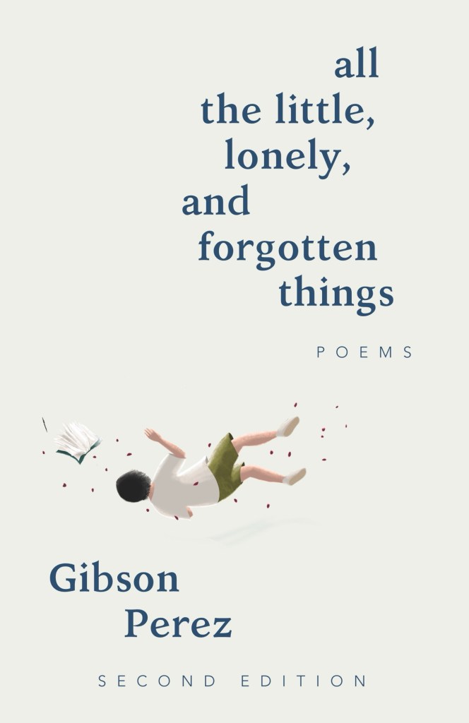
It’s simpler and cleaner — and it grew on me. I loved this one better (to think that Cris also suggested plain background in cream color and I didn’t listen!!) But why all the change?
First, I reconsidered that seeming look of a middle-grade novel, which was seconded by the thickness of the book (300 pages!). The poetry, I assumed, would appeal to teen readers, and making the cover less middle-grade-y, I assumed again, would make it appealing to adult readers. Since minimalism was a go-to approach to poetry book cover, I removed the night sky and used a solid color instead. I liked how this plain background became a representation of emptiness: the boy either sinking or floating in a limbo. Perfect for such a lonely book!
Second, the eccentric placement of texts was a compensation to following the minimalist trend. I immediately applied this idea because the poems were reimagined in that way (you’ll understand once you see the book). Consequently, the new cover design fit the whole vibe of the book. I just love how it turned out!
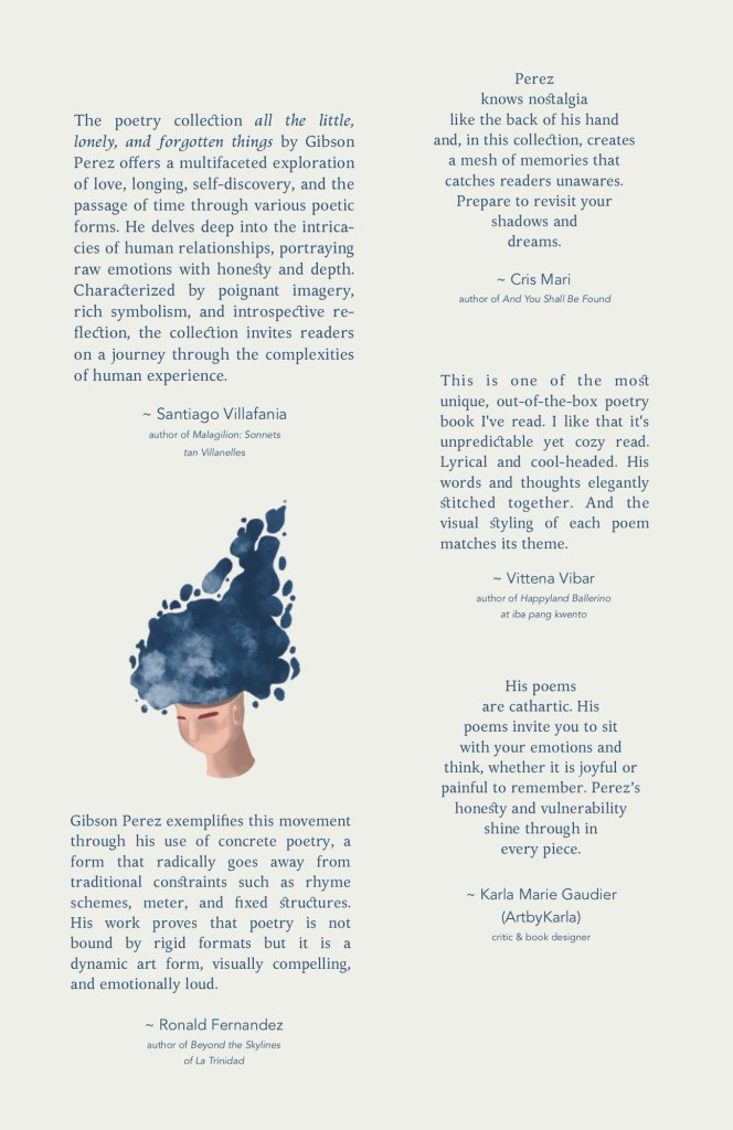
Third, the back cover again gave me a headache. So, I decided to add the excerpts of reviews from these generous authors (I’m forever grateful) that described what the book was and highlighted its strength. I heard blurbs were outdated but never mind. Instead of regular typesetting, I also arranged them more playfully to reinforce the aesthetics of the book. Plus another illustration for clout.
Whether you like the new back cover design or don’t, it’s what you’re going to see in print! *tongue out*
So there! I am very happy about the final output and happier to know that Social folks also find it cute. After all, a book is actually judged by its cover. Still finding a printer but I hope we all get to enjoy the cover and most especially the poems that I wrote for many years!
…
P. S. Book designing is my new-found love. I haven’t come up with commission rates, but I really want to collab with other authors soon, especially self-published ones like me. BRB.

Leave a comment